Tedd Tucker’s apartment looks like a bookstore these days. That’s how it goes when you take on every aspect of publishing your first book yourself – from the illustration and the layout, to the printing and the selling.
“I live in a box fort now,” Tucker joked in mid-November, the day after 2,000 copies of The Yukon Alphabet Book had finally landed on his doorstep. It was a moment five months in the making. That’s how long Tucker spent (in addition to the months devoted to text and illustrations) speaking with Canadian publishers, deciding on paper stock, getting an ISBN number and learning the language of publishing in order to put his project together.
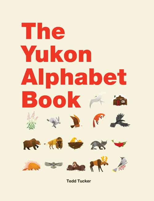
The result is The Yukon Alphabet Book, a matte-finish hardcover with thick, beautiful paper that teaches the alphabet by way of classic Yukon imagery. C is cabin. W is waxwing. M is moose.
“A was really difficult because A could be aurora but that’s kind of a mouthful for kids … I went with airplane because kids love airplanes and Yukoners love Air North.”
The book’s minimalist design puts Tucker’s bright, bold illustrations front and centre. You’ll likely recognize his style. Tucker, a graphic designer, is behind some of the in-house illustrations at The Collective Good, including the store’s Yukon subway map. He’s done logos and branding for Yukonstruct, Evergreen Wellness Studio, Grizzly Electric and more. He has done design work for the City of Whitehorse and the Yukon Youth Conservation Corps. His work has also been featured at Baked Café multiple times. His is a style that works well with the words he’s chosen to bring the alphabet to life.
“Because I don’t come from a fine arts background, most of the time I try and draw the simplest shapes I can,” he said. He wanted his images to be artistic, but simple enough for a child to draw. For example, when he came to the letter Q, which is quills, he asked himself what was the best way to draw a porcupine.
“It was like, oh, it’s just one big half oval and add a bunch of spikes and chaos to it.”
He’s simplifying, but that’s kind of the point. Simplicity can leave space for creativity, which was part of his goal with the book.
 “A lot of children’s books are pretty repetitive and get pretty boring and I just wanted to create a book that’s really simple and a kid can look through it on their own,” he said. “Or, also, because it’s so simple, it gives the parent a chance to perform, you know? D is dog and then it gives them the chance to be like ‘what does a dog do?’”
Tucker’s next book (also a kids book and also Yukon-based) will follow more of a narrative. He’s hoping to have some publishing support with that one. Though he established a publishing company to put out The Yukon Alphabet Book (Berwin—the same as the brand name under which Tucker does his design work), he’d like to have an outside publisher in the future.
“Shockingly, behind this house of cards, it’s just me. So the next one I’m hoping to take to publishers and shop it.”
He’ll do that in the new year, when he travels to a trade show and conference in New York City.
In the meantime, The Yukon Alphabet Book will be available at a handful of craft shows this season, including the Spruce Bog Boutique at the Old Firehall, from Dec. 7 to 22, and the 12 Days of Christmas Market at the Kwanlin Dün Cultural Centre, from Dec. 12 to Dec. 23.